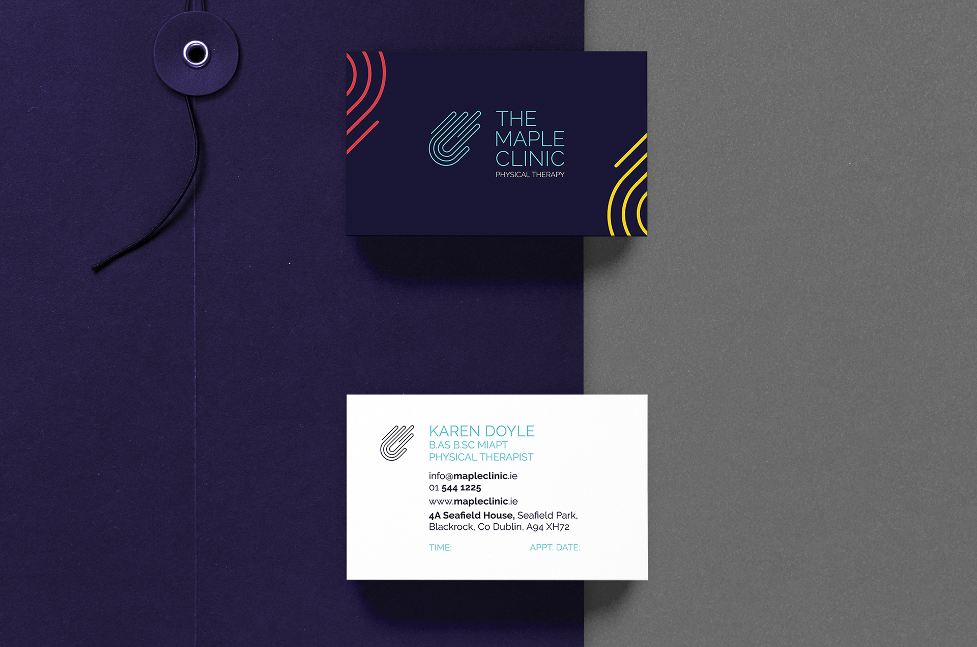
Karen Doyle of The Maple Clinic physical therapy contacted me for a rebrand to mark 10 years in business.
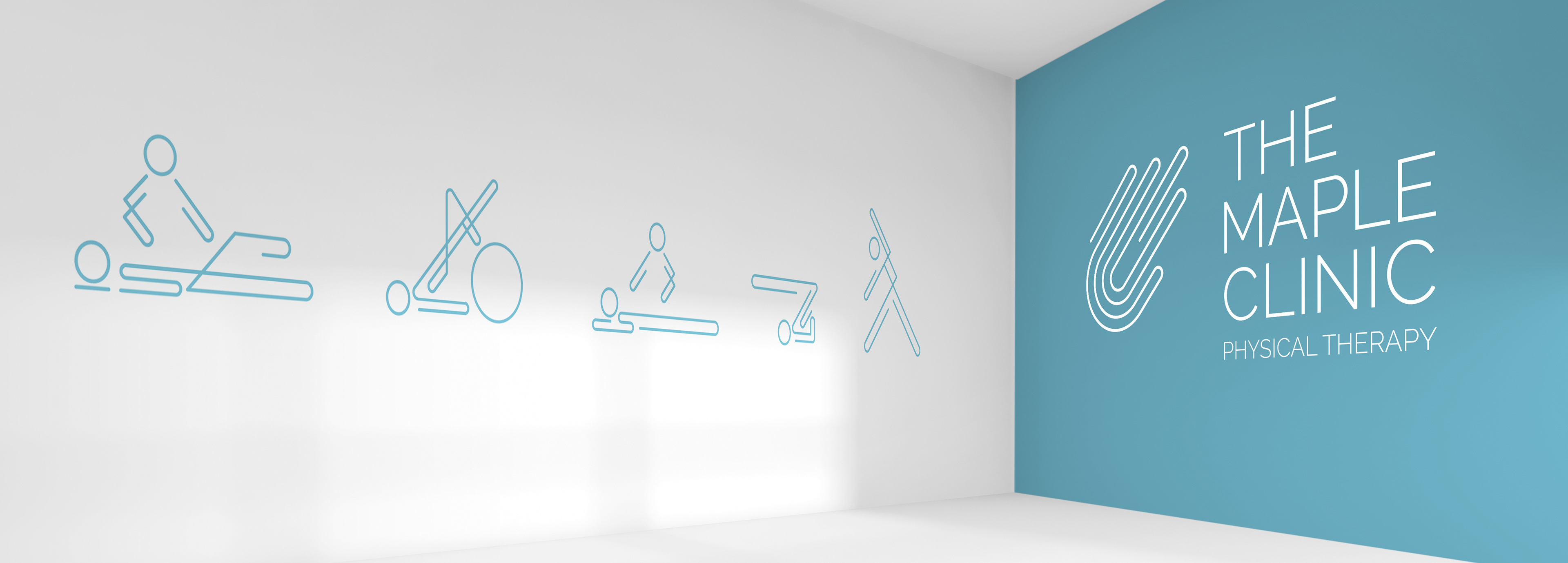
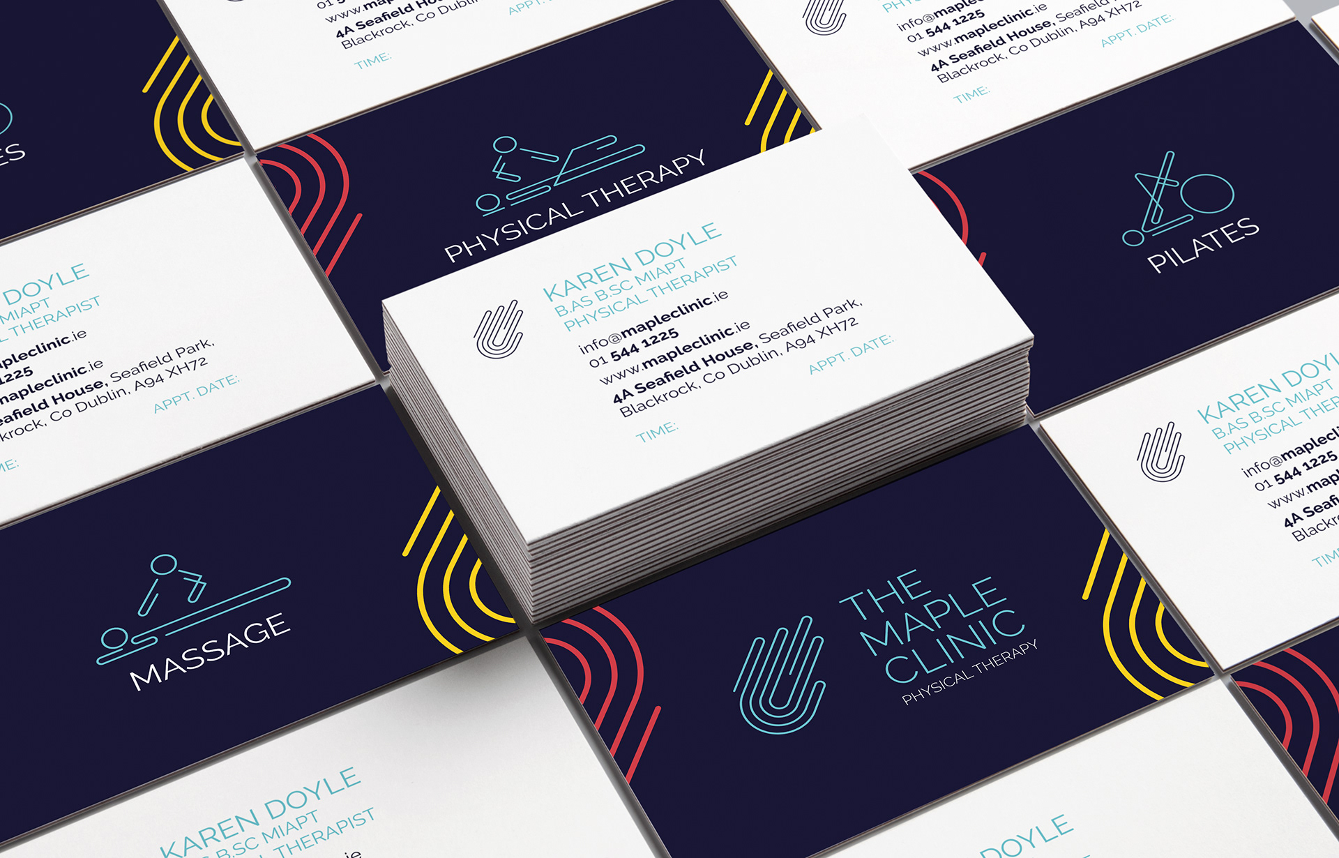
Karen focuses on sports rehabilitation, in particular runners, cyclists and climbers. The inspiration for the design of the brand came from how Karen works with her hands, a runners track, and finally a ball-and-socket joint, such as a hip or shoulder joint. The line that runs through the logo and supporting icons reflects the journey a person or athlete will take as they rehabilitates their aches and pains with the help of Karen.
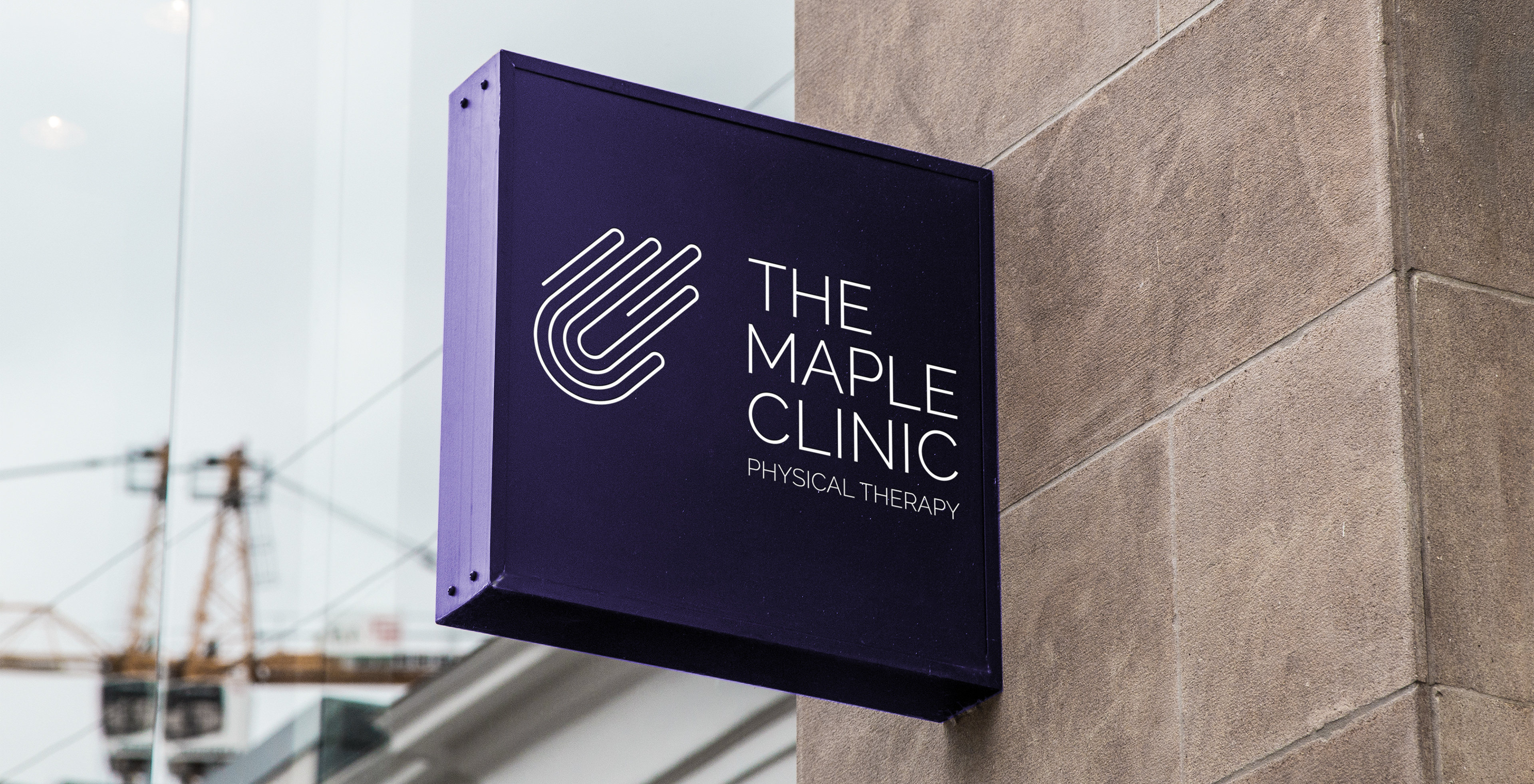
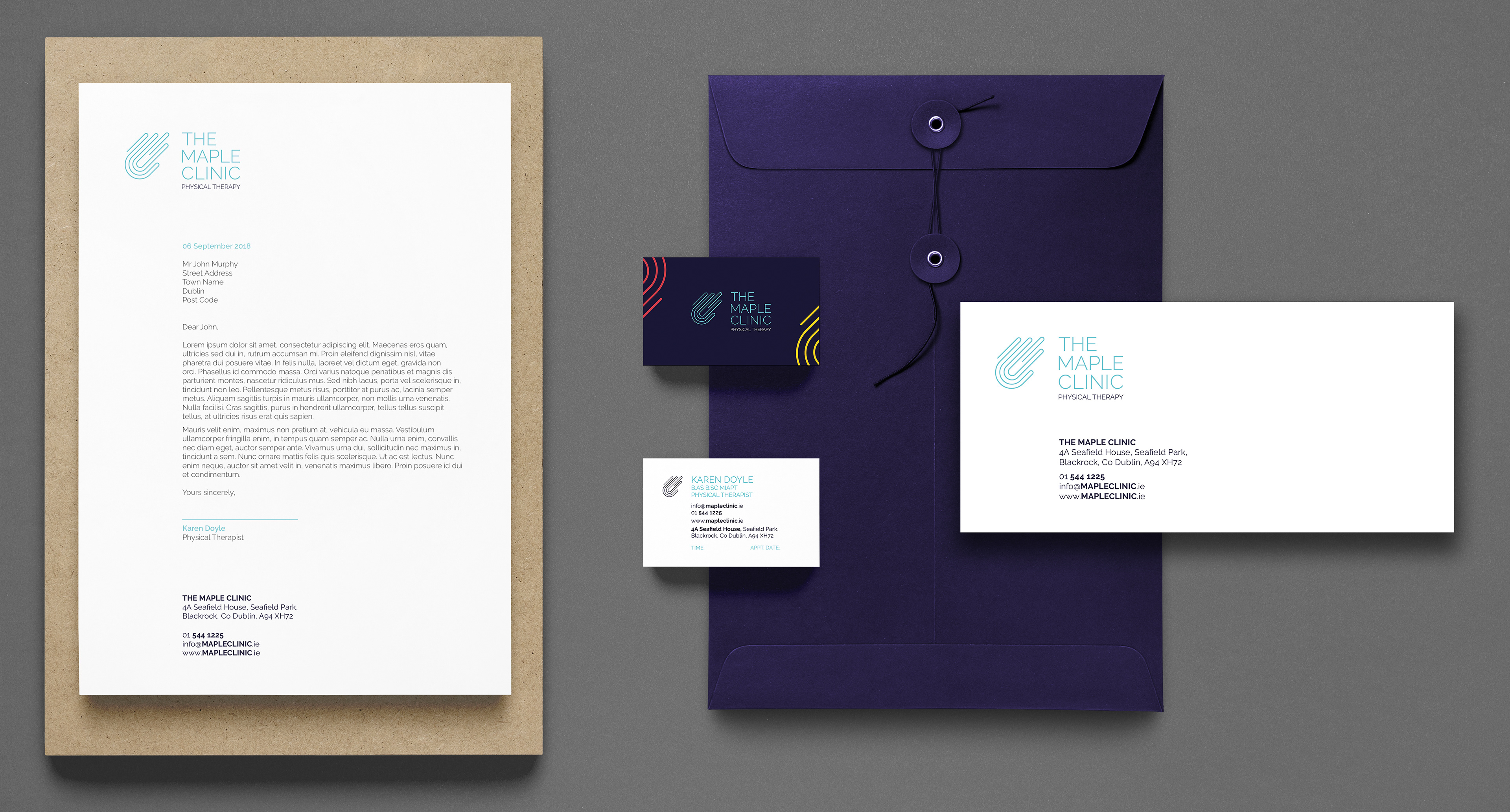
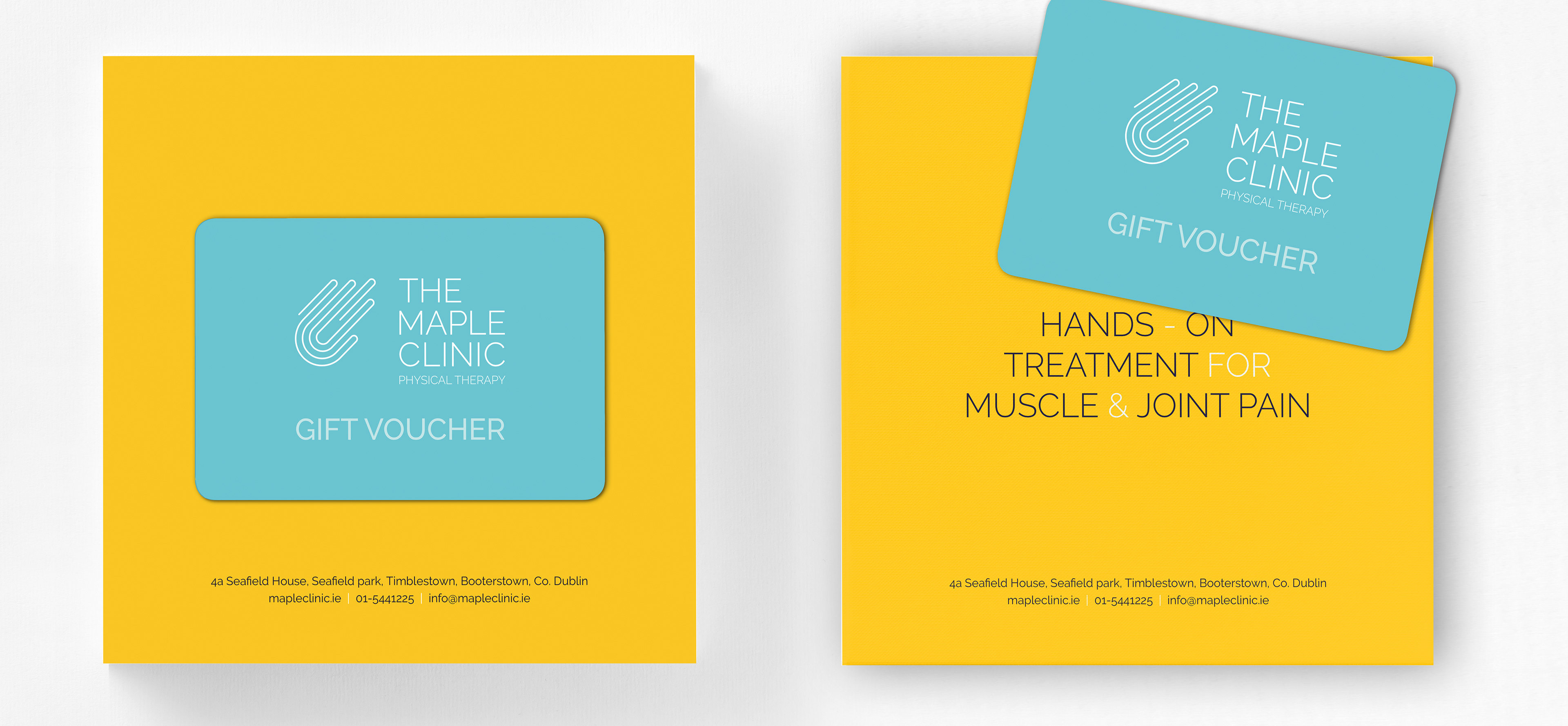
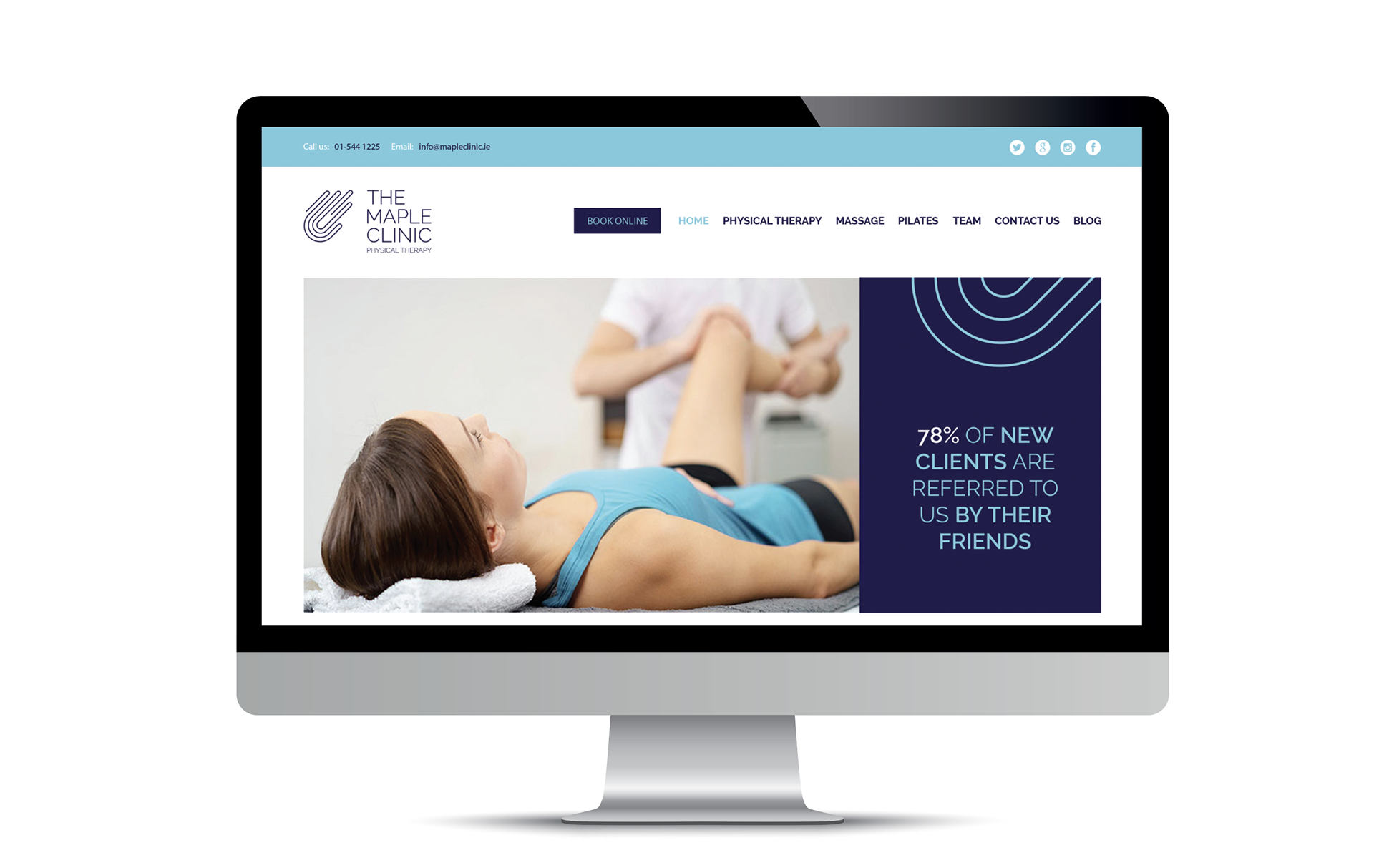
The identity was rolled out across signage, stationery, The Maple Clinic website, gift cards, and uniforms.